Selected work / 06
Real estate, investing and bidding in one interface
This stealth-mode startup combined property, investing, and bidding in one concept. I created the identity, wireframes, and user paths that made the idea understandable to homeowners, investors, and contractors.

- Client
- UTTERSPACE
- Location
- Houston, Texas
- Year
- 2022
- Role
- Branding, UX/UI Design
01 / The challenge
Distill a genuinely complex marketplace into pathways a homeowner, an investor, and a contractor can each follow without instructions.
Utterspace is a small startup in stealth mode that needed branding work, a wireframe, and user flow to introduce the brand concept. Without saying too much, the product combines real estate, investing, and bidding — with a dash of technology. Because the product was still in stealth mode, I had to communicate enough for people to understand the idea without overexplaining an unfinished platform. The work needed to give three different audiences a clear way into the same marketplace.
02 / What I led
Give three audiences a clear way into one product.
I created the brand identity, mapped the homeowner, investor, and contractor journeys, and designed the wireframes for the public site and product interface.
- 01Brand identity for a stealth-mode product concept
- 02Wireframes and user-flow design across homeowner, investor, and contractor pathways
- 03Marketing-site and product-interface layouts documented in the published case study
Each audience needed its own route without making the product feel fragmented.
03 / The key decision
Use the identity to explain the product.
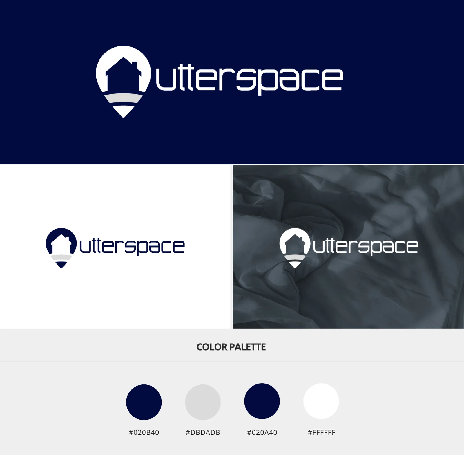
A house inside a location marker made property the visual anchor. Deep blue established trust, while color-coded pathways and interface signals helped each audience understand where to begin.
04 / The solution
Brand, interface, and distinct user paths.
A house-in-pinpoint mark, deep-blue identity, and a minimalist interface with color-coded routes per user type—plus bid sliders, investment toggles, and a flowchart-based home search designed to stay simple as the product scales.
A mark that locates the idea.
A house inside a location marker made property the visual anchor. Deep blue established trust, while color-coded pathways and interface signals helped each audience understand where to begin.
Routes people can follow.
Identity, marketing site, and product interface share a deep-blue, high-contrast system. Color coding and visual indicators create distinct routes per user type; interactive bid, investment, and search patterns sit on a scalable wireframe kit.
Simple enough to scale.
Three user journeys mapped, one scalable wireframe foundation, and a recognizable identity for launch conversations.
05 / The impact
An early-stage idea people could finally enter.
Three user journeys mapped
Homeowner, investor, and contractor paths into the same marketplace, without making the product feel fragmented.
One scalable wireframe foundation
Marketing-site and product-interface layouts documented so the concept could evolve without losing its simplicity.
A recognizable identity for launch conversations
A house inside a location marker, deep blue, and color-coded pathways that helped each audience understand where to begin.
06 / Web experience
Marketing site & product interface
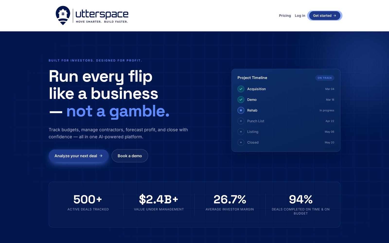
The public-facing site carries the brand into a product story: a deep-blue environment, high-contrast headline typography, and live data cards that show the platform tracking a deal from acquisition through close.
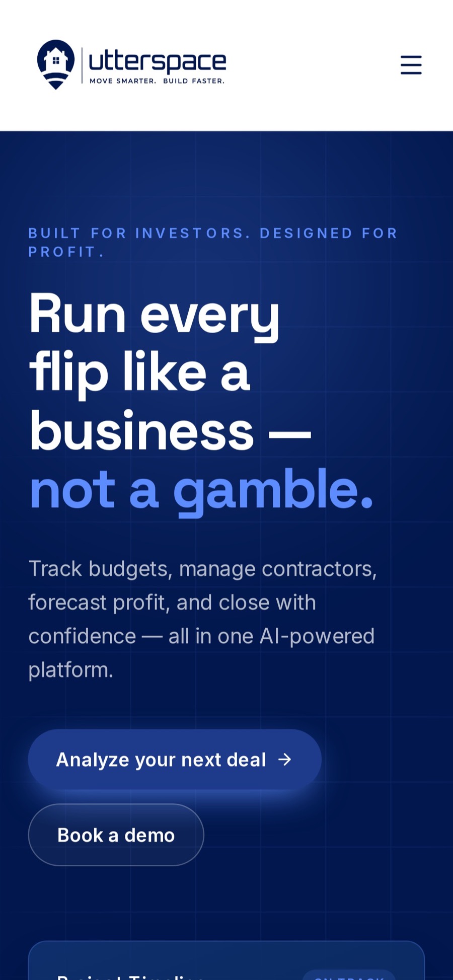
Layouts were built mobile-first so the same hierarchy — positioning line, headline, proof metrics, primary action — holds from a 4-inch phone to a wide desktop screen.
07 / Reflection
From a name to a world people could enter.
“Early-stage product work is often less about having every answer and more about giving the right people a clear way to understand the opportunity.”
Identity opens the door.